ADP Direct Deposit
June - August 2015

Overview
These designs were created as part of my summer 2015 internship with ADP. I worked as a UI / UX Designer and Developer, iterating on the mobile and web designs for a fully responsive direct deposit webapp. This app aims to simplify and give flexibility to the direct deposit experience. I used a mobile first approach, designing full webpages last. Upon finishing the mockups, I worked with other interns in the development team to implement these designs.
Project Details
Internship:
UX Designer & DeveloperMy roles:
Design, Iteration, DevelopmentContext
Signing up for direct deposit can be a long and cumbersome process. Employees receive paper checks for weeks until their direct deposit request goes through, and often this can be further delayed in the all-too-likely event that the routing or banking account numbers are entered incorrectly. This application aims to make signing up for direct deposit easy, reduce the possibility of entering incorrect account numbers, as well facilitate splitting paychecks among various accounts. It is meant for anyone who wants a simple yet customizable direct deposit experience.


Challenges
Development Revisions
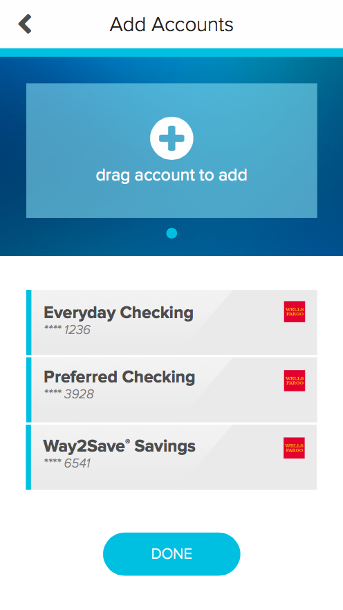
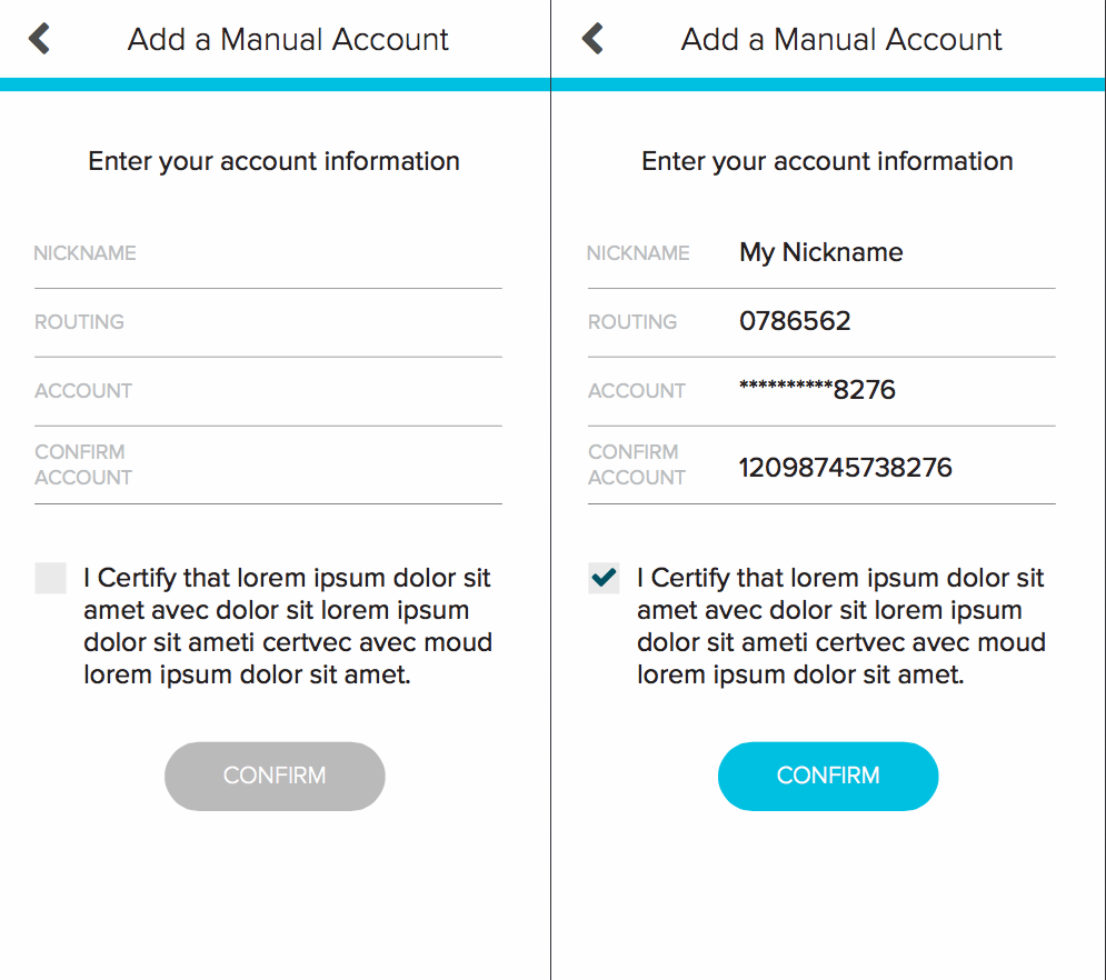
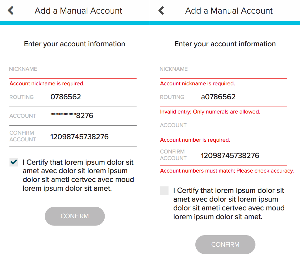
This project was a great learning experience for how to communicate and work with developers as a designer. I got a lot of experience negotiating features with the development team and learning how to make a case for changes that benefit usability. For instance, earlier designs of the manual account addition page had only one input field on mobile, which would animate and change to a different field type. After evaluation, however, I needed to make a case for displaying all of the necessary inputs on a single static page so users could know upfront what they are expected to enter.
Heuristic Evaluation, Not Usability Testing
Oftentimes making a full case for UX changes was difficult because I did not have the chance to speak to potential users outside of our work environment. Given the short time frame and how the UX mentorship was structured, feedback was primarily obtained through heuristic evaluation of the static designs and InVision prototype. While this worked for the most part, I would have loved the chance to interview more users who knew nothing about the project.
Process
Discovery
I came on-board once the app designs were beginning to be developed, so I did little discovery and research. For the most part, my design choices were informed by my own knowledge and skills, as well as the advice of my mentors. I worked independently and asked my mentors and co-workers for feedback, as well as for clarification on the current direct deposit process.
Mockups
My work was mainly concerned with iterating on the already existing Illustrator mockups. I worked on this project for 2 to 3 weeks as the only intern for this stage, in collaboration with 2 full-time mentors who I could ask for advice when needed. I iterated on the mobile-first designs, tested their effectiveness with an InVision prototype, then created the web layout from there.
Development
Once the mobile and web designs were finalized, I moved to the front-end development team to help implement them. During development, I worked with 4 other interns and 2 full-time developers. I worked mainly on developing the tutorial screens and manual account addition page. I loved having the chance to bring my designs to life in this stage.
Final Functionality
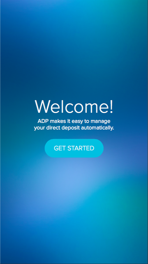
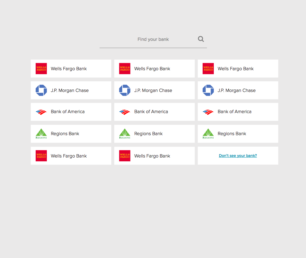
The application begins with a welcome screen, then asks new users to search for their bank. If it is one of the 14 partner banks, it will be listed and have a secure login page. If not, users may choose "Don't see your bank?" and go to the manual bank addition page.
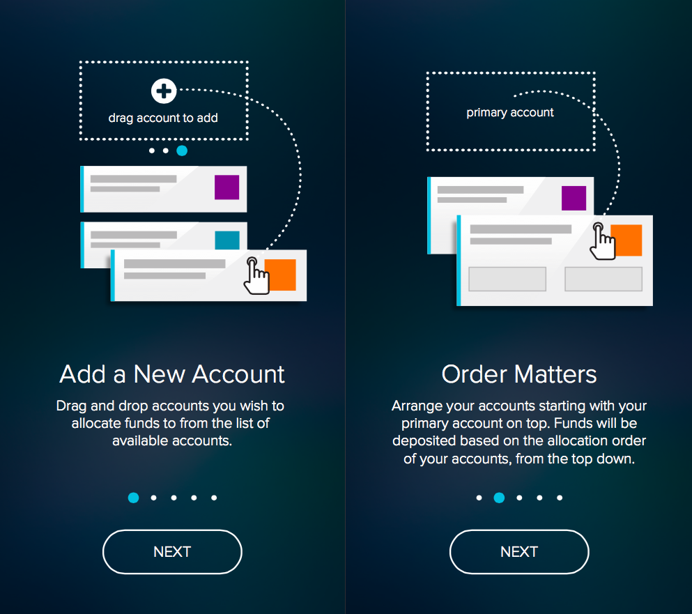
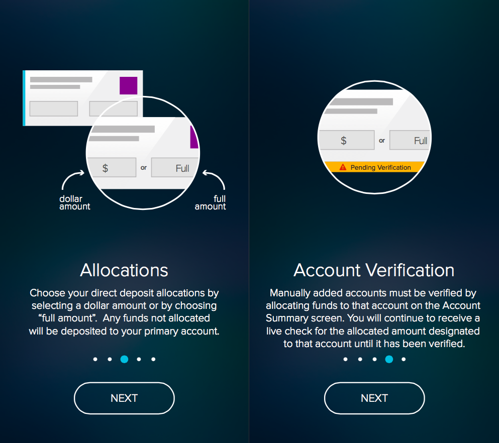
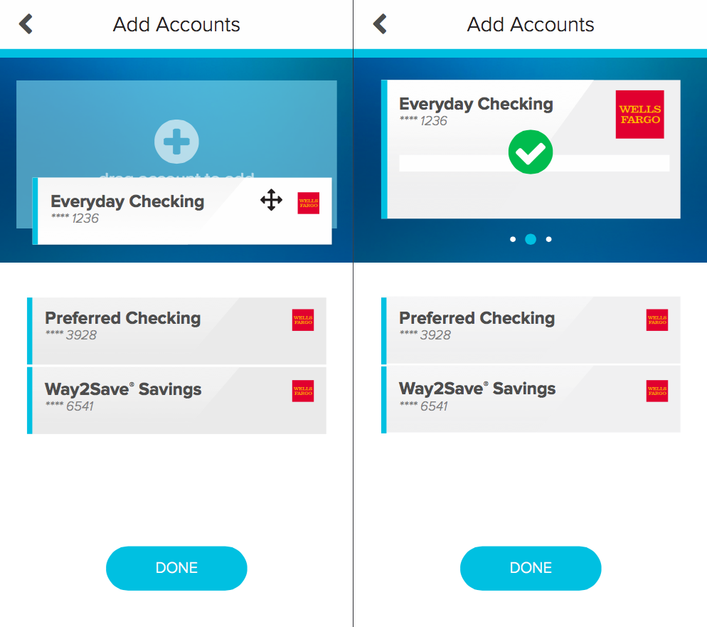
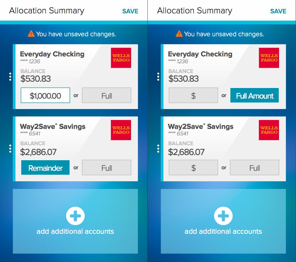
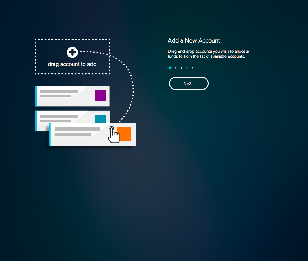
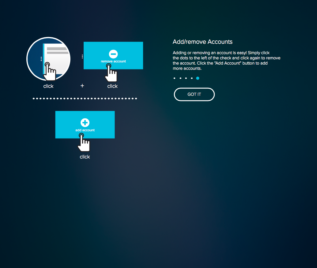
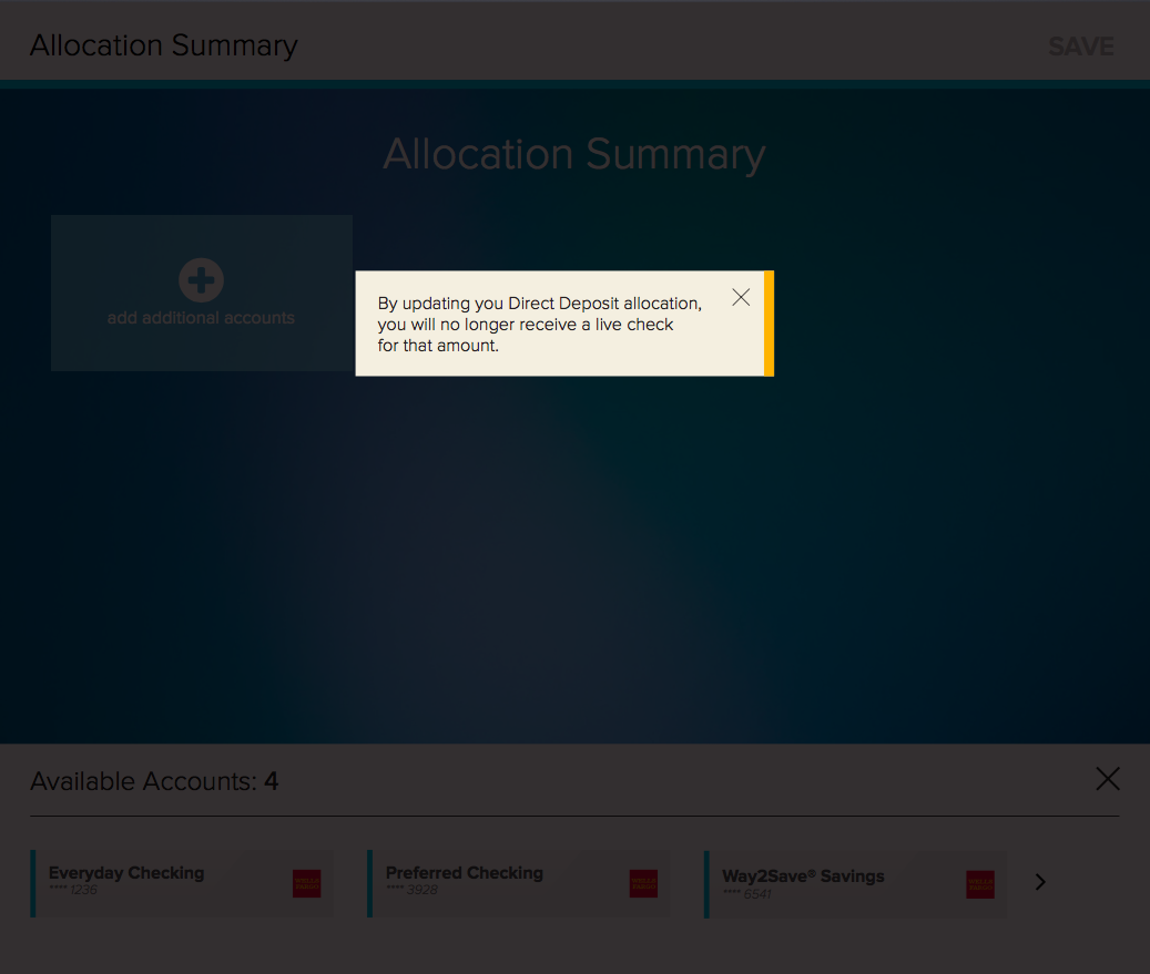
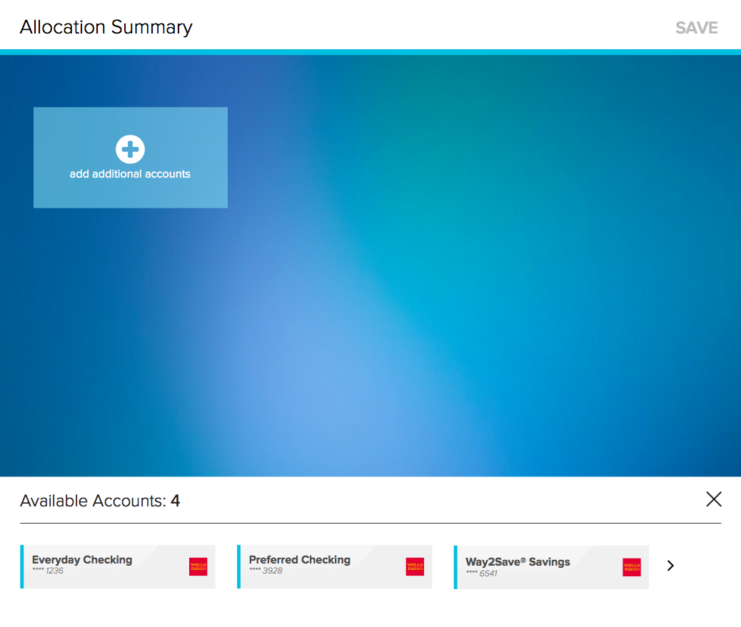
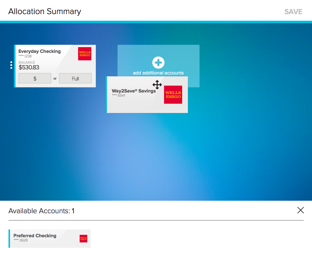
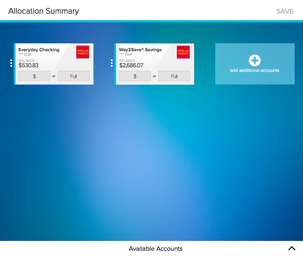
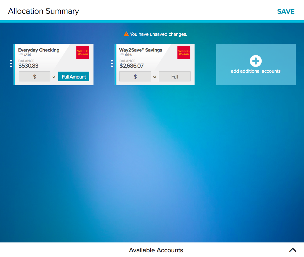
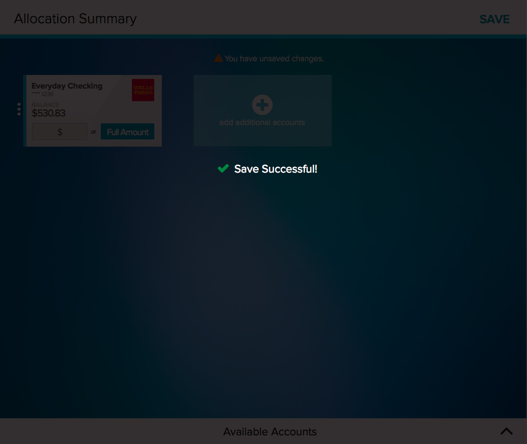
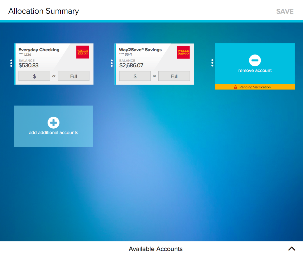
Users can drag and drop any desired accounts so that they appear on the Allocation Summary page. Users may then choose to put any amount of their potential paycheck to be deposited amongst the various accounts, split as they like. The allocation works like a waterfall, filling up allocations in the order presented on the summary page until there is no money left to allocate.


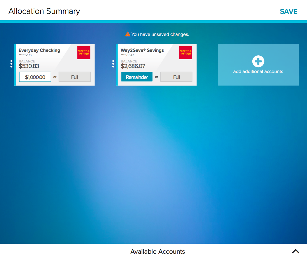

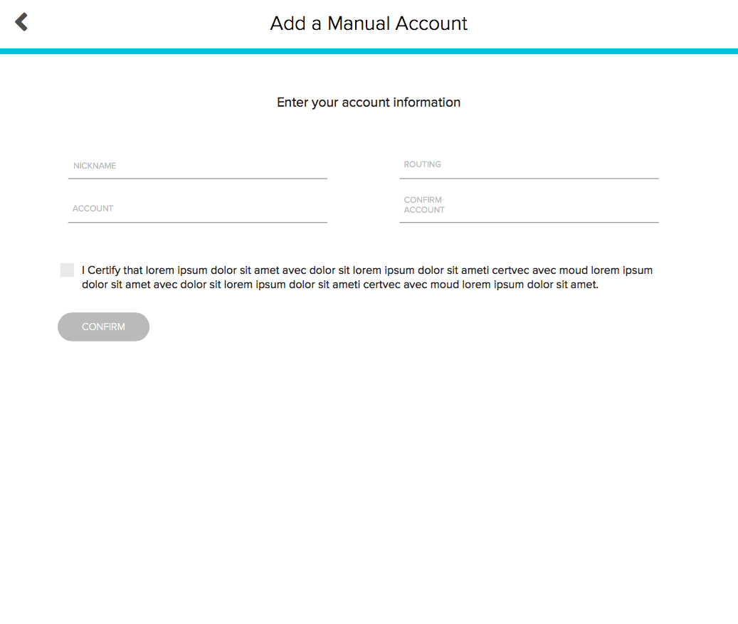
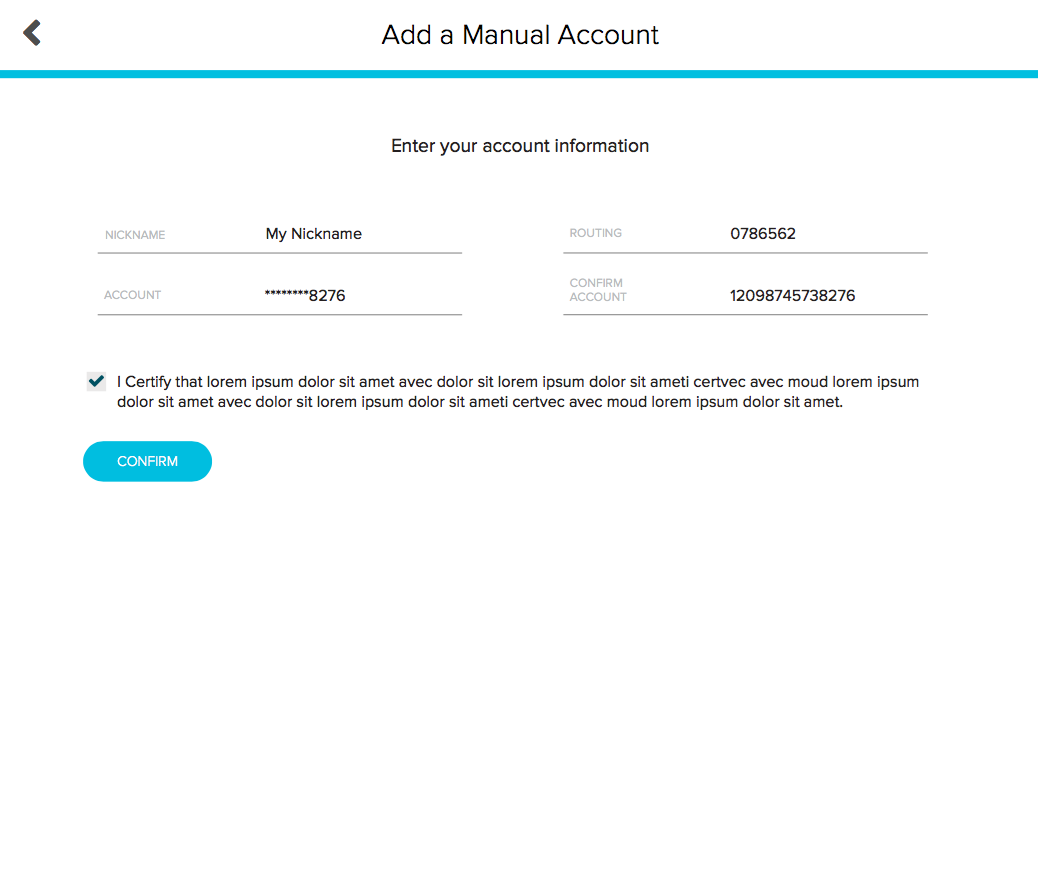

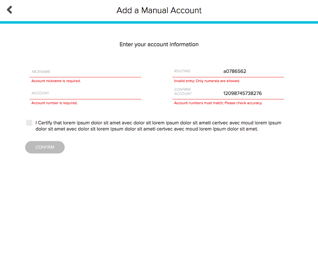
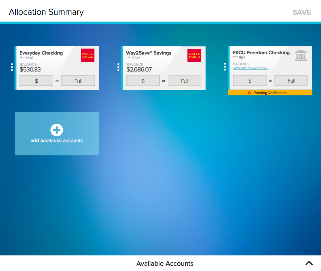
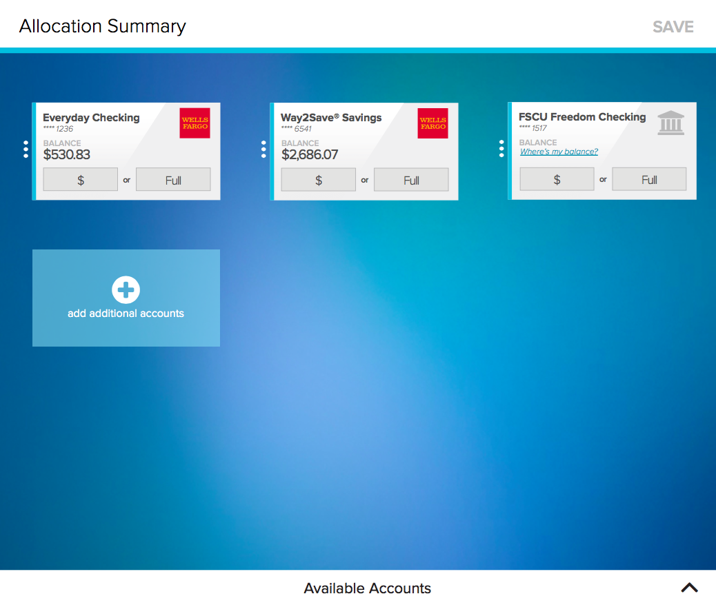
The design is intended to be very straightforward, considering it deals with paychecks, but still powerful enough to allow users to customize their deposits as they desire. The secure partner bank login eliminates the need to enter routing and account numbers, which are long and easy to incorrectly type in. Manual account addition catches all banks that do not fit the criteria of the secure login, and is all on one simple page to make the inherently tedious process as painless as possible.
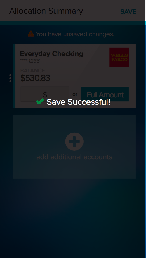
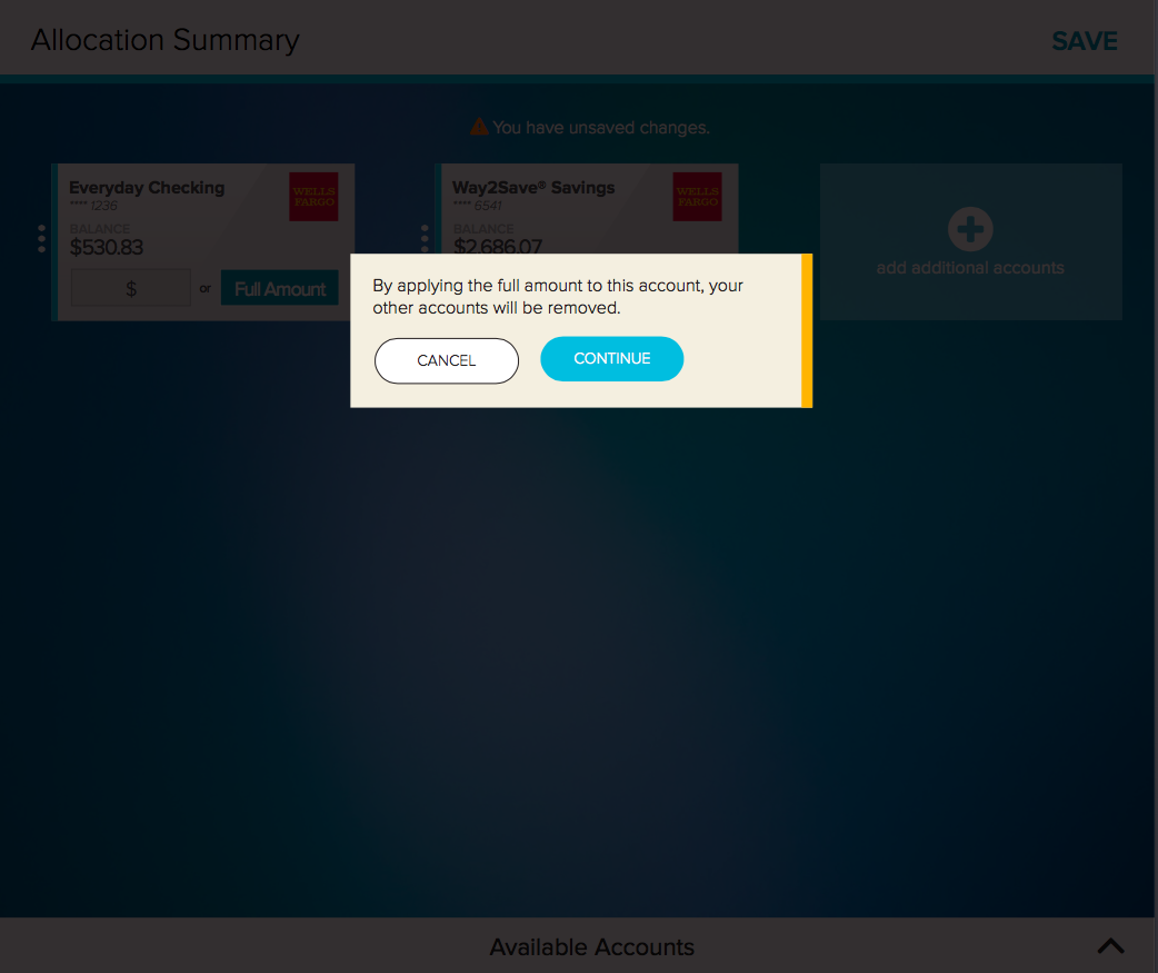
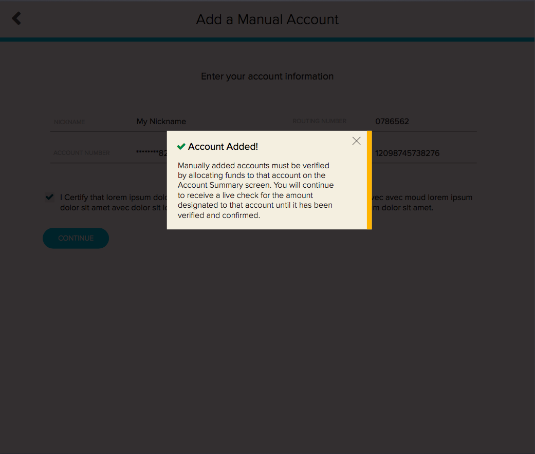
Finally, informative alert boxes appear throughout to fully inform users of the consequences of their choices. Again, given the sensitive nature of the application, these were deemed necessary to help users not become frustrated or confused regarding their paycheck.